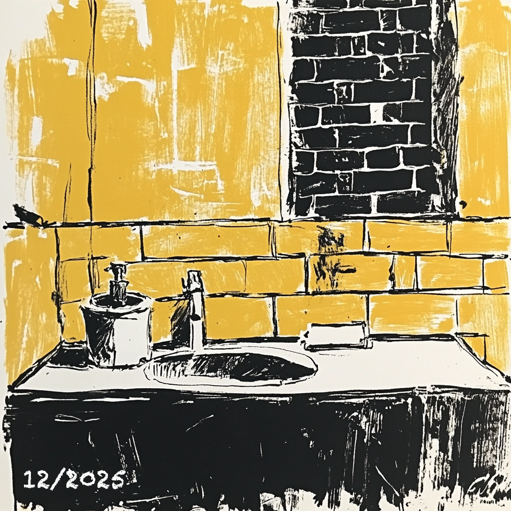
Image © Jose 2025
Let’s talk about color. I mean color as the emotional undercurrent of space, the layer that comes after structure and before memory. And I want to talk about chroma, the intensity of color, its force, its emotional weight. Because if you’re renovating, and you think color is just the paint on the wall, buckle up.
We’re deep into the renovation now, supposedly 3 weeks away from moving in (..). The kind where you’ve made the hard calls (doors, windows, walls moved, plumbing re-routed,…) and you’d think the rest is about choosing finishes and paint. You’d think wrong. This is where it gets murky. Where design meets emotion. Where people who live in the same house, love each other dearly, suddenly realize they don’t see the same color when they say “off-white.”
The green tiles on one of the bathrooms upstairs are deep and beautiful, but chroma is a tricky companion. What feels lush and grounding in the morning light can feel loud and claustrophobic by dusk. The yellow tiles in the other bathroom, a different gamble; joyful in concept, but when paired with the warmth of the brick chimney that traverses the space vertically, they either glow… or clash. Sometimes in the same day.
This is the part where I remember just how relational color is. It’s never alone. A yellow doesn’t just sit there being yellow, it plays with the light, the trim, the flooring, the mirror above the vanity. It picks up undertones from the vanity countertop, or fights against the nearby red textured brick. Everything depends on everything else, and chroma – how saturated, how loud or subtle the color is – becomes a dial we keep adjusting, mostly blind.
Let’s talk about wood for a second.
There’s a complexity in trying to align different wood tones and stains that no one warns you about until you’re knee-deep in samples. One wood reads red, another yellow, another leans greenish-gray, and depending on the finish, the same species can whisper or shout. I used to think “just pick a nice oak.” Then I stood in the room, samples in hand, and realized that oak alone can look like five different things depending on cut, grain, and seal. Mix in the Brazilian cherry floors that came with the house and… well, now we’re making color theory jazz.
And stone? Don’t get me started on stone-based materials, engineered or natural. The undertones can fool you. A gray that looks cool and crisp in the showroom turns warm and muddy at home. That white marbled countertop? Hides a green vein that only appears under overcast skies. You end up spending way too much time holding swatches against slabs under every kind of bulb you own.
There’s this moment, usually on a Sunday when you’re supposed to be resting, where you stand in a half-finished room and realize the color decisions ahead of you are less about taste and more about negotiation, between daylight and artificial light, between memory and practicality, between what you imagined and what you can get your hands on in time.
Which brings me to samples.
Years ago, visiting architecture and design studios, I remember being in love with their sample libraries. Cabinets and drawers of tiles, fabrics, paints, wood chips, metals categorized, cataloged, stacked in little labeled boxes. Like a candy store for people who obsess over surface and texture, like me. Now, going through this renovation, I come back to the need to touch and hold and compare things side by side, in real light, at real scale. The absurdity of choosing a floor finish off a 3-inch square. The impossibility of guessing what a random toned tile will look like when it covers an entire shower wall.
And yet, those cabinets are disappearing. Too expensive to maintain, always outdated. Vendors push us toward digital samples, slick renderings, “immersive” online tools. But you can’t feel a texture on a screen. You can’t see how a glossy tile refracts light at noon, or how a matte one absorbs it like a whisper. Samples are disappearing just when we need them most. This renovation has made me appreciate the imperfections of analog tools. The false precision of digital confidence. That bit of cardboard paint chip that seems “close enough” until it’s not.
And then there’s the emotional layer:
This isn’t just about the house. This is about the people who live in the house. About two very different histories, palettes, and instincts trying to share space. We agree on a lot. And we don’t. And that’s fine, because this house, in the end, has to reflect both of us. Sometimes, the compromise is the best part. CMF isn’t a checklist. It’s a negotiation. It’s how a home feels like yours, how a room carries meaning without saying a word.
More to come. Let’s see how many times we will have to paint that living room.
Comments
Powered by WP LinkPress